
By Niels Vestergaard
Generation Z has increasingly emphasized its love for solutions that make it easier to keep track of budgets and preferably platforms that can gather all your concerns regarding household budgets, investments, travels, savings, and much more.
At home, it’s particularly apps like Lunar and Spiir that have been leading in this category. But today, we’re going to talk about the American app Copilot (not to be confused with Microsoft’s AI assistant of the same name), which has achieved impressive success in just 3.5 years.
Copilot er startet af tidligere Google-medarbejder Andrés Ugarte i 2020, med en mission om at udfordre den dengang meget større app, som havde et noget mere sparsomt design og begrænsede funktioner. Og det er netop brugervenligheden, som vi vil kigge på i denne artikel. For vi kan alle lære noget af den måde Copilot har opbygget deres brugeroplevelse.
Copilot was founded by former Google employee Andrés Ugarte in 2020, with a mission to challenge the then much larger Mint app, which had a somewhat sparse design and limited features. And it’s exactly the user-friendliness that we’ll focus on in this article. Because we can all learn something from the way Copilot has built their user experience.
Prioritizing a fantastic UX experience shows on the bottom line
Copilot has just received $6 million in Series A investment in Silicon Valley, following numerous App Store nominations and a “Best UX Nominee” from the Webby Awards.
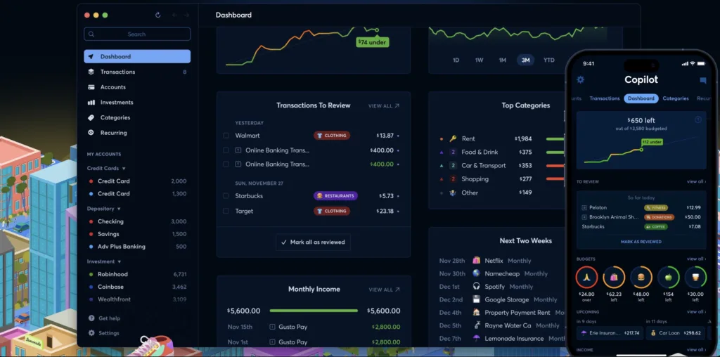
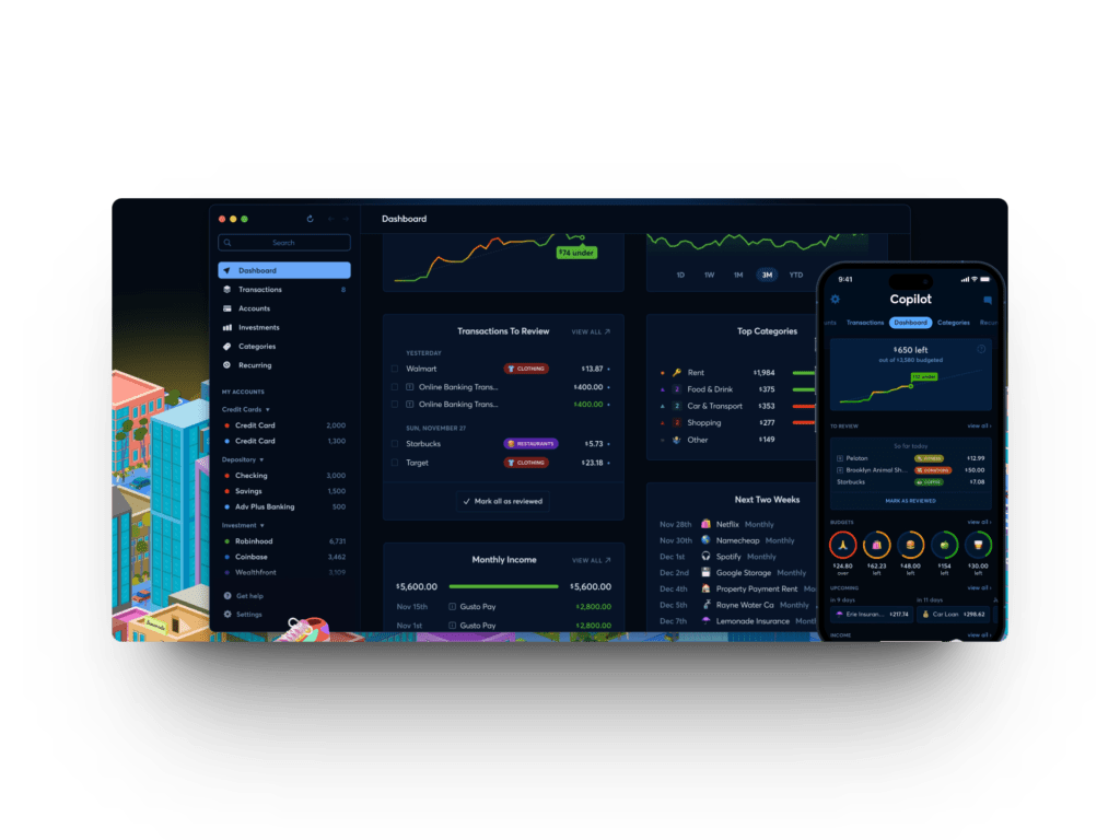
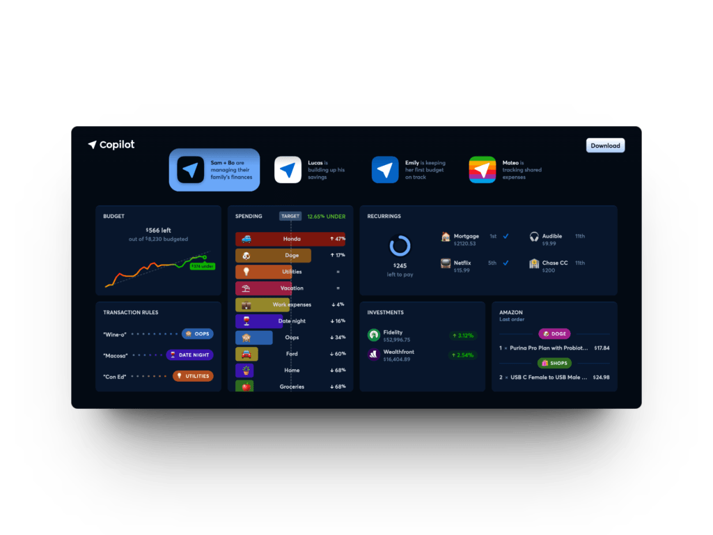
Copilot categorizes all your transactions, keeps track of your savings and investments, and does so in a friendly environment filled with colors and emojis. Copilot is only available for Mac and iOS, and it’s clear that Copilot has focused on integrating itself just as well as an original Apple app. Copilot has interactive widgets in all sizes, ensuring they remain top-of-mind for users while keeping an eye on the monthly budget. And of course, they have also integrated machine learning to better categorize your transactions, so you always have a clear overview of what your money is being spent on – and most importantly – how much money you have left in each category.
A gamified experience makes it fun to keep track of your budget
The lesson here is that there are many ways to make something otherwise dry more interesting. And that’s something subscription businesses can learn a lot from. Because no matter how great the idea behind your product is, if you can’t present it visually appealingly, it usually falls flat. Moreover, it’s also important to integrate exciting and perhaps even entertaining elements into your subscription, to create the good habit.
At Copilot, they have several smart features to keep you updated on your budget:
- Daily Snapshots – Every day, you get an overview of what you’ve spent, and you can see which bills are due in the coming days. You can also track payments you’re owed.
- Rollovers – With Rollover budgets, you can set your monthly budgets to adjust if you didn’t use it all up last month. That way, it feels a bit like a gift for next month if you have a few dollars left over in your clothing budget, restaurant budget, or similar.
- Cash Flow – Like something out of Spotify Wrapped, you get a monthly overview of your expenses and a summary showing the change in your spending – have you spent more or less than last month, have you saved more, how are your investments doing, etc.
- Recurring Payments – At Copilot, you can, of course, keep track of your subscriptions, pause or cancel agreements, and monitor any price increases. A side note here is that it’s features like these that make consumers demand even more from you as a subscription business. Get used to it!
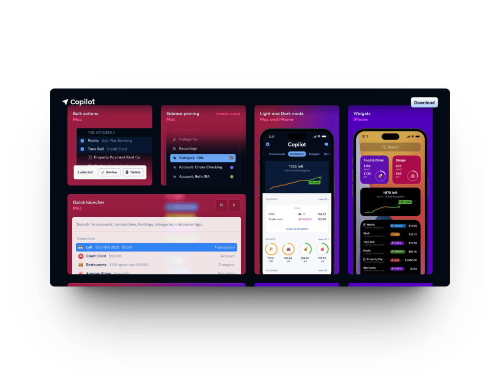
Additionally, Copilot boasts an unparalleled design heavily inspired by Apple’s own apps (several employees at Copilot are former Apple developers). The entire experience is extremely polished, and you can customize the app to either Dark or Light mode on your iPhone, which can also increase user engagement (Light mode during the day and Dark mode in the evening when checking finances).
A secure and serious subscription product with great potential ahead
Of course, Copilot is also focused on data security, as they need access to your accounts and investment platforms. That’s also why there isn’t a free version of Copilot, which costs $7.92 per month or $95 annually. These funds are used, among other things, to ensure users’ data security across accounts and channels.
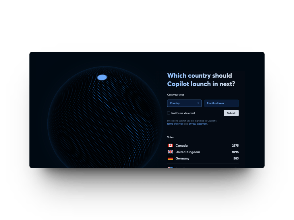
Currently, Copilot has around 100,000 (very) active users, resulting in a quite reasonable revenue already. And they are still only available in the USA. I myself was disappointed to find out that we couldn’t try the app here at Subscrybe, but apparently, I’m not alone. Copilot has actually dedicated a page where you can vote on where the app should be launched next. That’s also good UX – and a fantastic way to gather email addresses in new markets. Denmark is currently number 25 on the list – so feel free to go in and vote if you’re as excited as I am!
If you’ve become interested, there’s plenty of UX inspiration to be found on Copilot’s website. Perhaps your website or app could learn a bit from them?