Subscription Guide
By Frederik Weis Holst
In my work at Subscrybe, I often meet subscription platforms that cannot be classified as ‘subscription ready’ and therefore, aren’t geared for supporting the value offer of the subscriptions. This can result in:
- Users not even signing up as subscribers
- Your company missing revenue and sales
- Users churning, because handling the subscriptions is too much of a hassle
De 7 UX-greb, jeg præsenterer dig for, øger brugerloyaliteten, hvilket resulterer i øget omsætning per bruger, og hvilket ultimativt booster kundelevetiden.
The 7 UX tools that I’m about to present to you increases user loyalty, which results in increased revenue per user (ARPU) which ultimately boosts your Customer Lifetime Value (CLV).
Here are the 7 UX tools you’ve been waiting for:
- Present your value offer so it’s easy to decode
- Create synergy across the supporting systems, so the user gets a coherent user experience
- Make it easy for the user to administer their subscription
- Clearly present the most important information on the subscription
- Present the value of the subscription to the user
- Make it possible for the user to add products to their next delivery
- Eliminate obstacles and help the user instead
#1 – Present your value offer so it’s easy to decode
On your digital platform, the user needs to be able to decode the outcome of subscribing to your product or service – and this should happen as fast as you can say ‘reason-to-subscribe’.
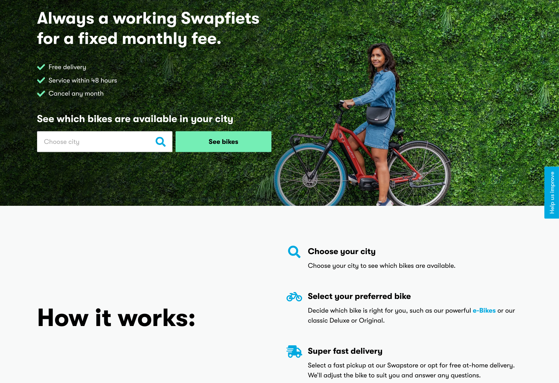
“A Swapfiets that always works, at a fixed monthly price” quickly explains why the user should subscribe to a bike, instead of buying one, since the user will not have to deal with:
- Clicking gears
- Screeching brakes
- A hanging bike chain
My recommendation is that you support your one-liner with a ‘How it works’ description, where you explain the steps the user needs to go through to get started with the subscription.

Snippet from the Swapfiets website with a distinct one-liner and ‘how it works’ description
And why should you do this?
Two quick lessons in nudging and desired behaviour: 1) the desired behaviour should be made easy to overcome for the user, and 2) the motivation for executing the desired action should be high.
You increase the motivation for subscribing to your product or service with a simple one-liner talking into the pains that your users have. By describing how you quickly and easily get started with the subscription, you make the desired action easy to accomplish. And this – ladies and gentlemen – is the perfect cocktail for triggering desired behaviour.
#2 – Create synergy across the supported systems so the user gets a coherent user experience.
You must secure synergy in the user experience across the systems and plugins used on your subscription management platform. To achieve this, you need to design a coherent user interface across your payment- and shipping plugin and your E-commerce system. This is how you avoid users feeling lost, when they navigate between the different sites on your platform.

At The Champagne Box, the user is redirected to a branded self-service site when logging in.
#3 – Make it easy for the user to administer their subscription
Even though you wish that your subscribers never churn, this is rarely the case, since:
- Interests and preferences of the user changes
- Users go on vacation and don’t need the subscription for a while
- Something new happens in the life of the user which spawn new needs
If you make it difficult for your users to edit preferences, amounts or delivery frequency there is a very real chance that they will get frustrated and cancel their subscription.
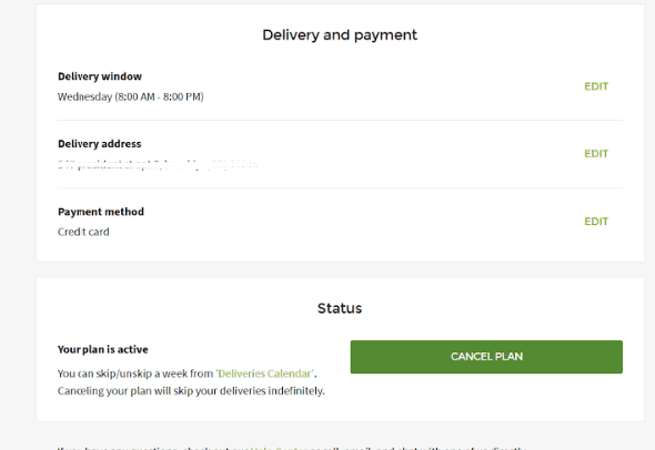
Instead, I’d suggest that you put the user at the center and make it easy for them to administer the subscription with a self-service site.
Therefore, give your users the opportunity to: 1) pause, 2) postpone and 3) expedite their coming subscription delivery and make it easy to change or add new products to the order. The more flexibility you can give the user, the better you are adapting to their changing lifestyle and users will most likely stay subscribed for a longer time.

At Aarstiderne, the user can pause, postpone and expedite delivery of their next meal box.
#4 – Clearly present the most important information about the subscription
Without discussion, untransparent subscription packages and prices lead to bad customer experiences. Therefore, clearly present the collected price for the subscription and be explicit about what is included in the subscription.
If you have several subscription solutions, it is crucial that you make it easy for the user to decode, what the difference between solutions are.
Make sure to present information about the active subscription of the user on the self-service site, including:
- Product pictures
- Subscription Title
- Variance information (colours, taste, size)
- Amounts (number, kilos, pounds)
- Prices
- Next delivery date
- Delivery frequency
- Delivery address

At Blue Tokai, the user can easily get an overview of their active subscriptions.
#5 – Present the value of the subscription to the user
If your subscription model builds on a ‘subscribe & save’ solution, the discount might be the main reason for subscribing for most users. However, the memory of your users might fade away and they might forget all about the discount they’re getting and effectively, the value that you offer in your subscription.
Therefore, I’ll recommend that you remind users of the discounts they’re getting in their order confirmations or on the self-service site. This helps to secure that they with each delivery are reminded of the value they are getting through the subscription.

Goodiebox makes it clear to the user what the actual value of the box is, as opposed to the cost of subscribing.
#6 Make it possible for the user to add products to their next delivery
If you’re interested in increasing the average order value, you need to make it easy for the user to add more products to the upcoming delivery. At the same time, users are spared from going through another checkout flow.
Back to the theory about nudging and behavioural design. If you make it easy to add more products to a planned order, you increase the probability that it will happen.
If you implement this feature, you need to make sure to tell your users about it. You can do this in an e-mail or in a pop-up message on the self-service site, where you’ll present the user to complementary products to the planned delivery.
Example: “You’ve planned a delivery of coffee. Spoil yourself with little chocolate for your coffee and add it to your order!”

Here, a complementary product has been added to the planned delivery
#7 Eliminate obstacles and help the user instead
It might seem counter-intuitive, but you shouldn’t make it hard for users to cancel their subscription. Instead, set up a short and simple, automated retention flow, where you offer alternate options for a cancellation.
When a user clicks ‘cancel subscription’, you can ask them, why they wish to cancel. Depending on the answer you can give them the opportunity to:
- Postpone the next delivery
- Pause the subscription for a short period
- Adapt the contents of the subscription
- Give them a retention gift
These options can ultimately become a win-win for users and naturally, for your subscription business.
I speak from experience when I give you the next tip: Don’t make the flow too long, since it can quickly become a nuisance and you don’t want to leave your relationship with the user like that. You never know if they might subscribe again in the future.
Also, use the opportunity to ask the user how you can improve, which will help you optimize your product and service experience.

An example of a retention flow
The first thing you need to do is this:
Subscribe to your own product or service.
Why? you might ask. Because mapping the user journey is central to the success of your subscription platform – and who is more suited to do this task than yourself? (The answer is: Nobody!)


